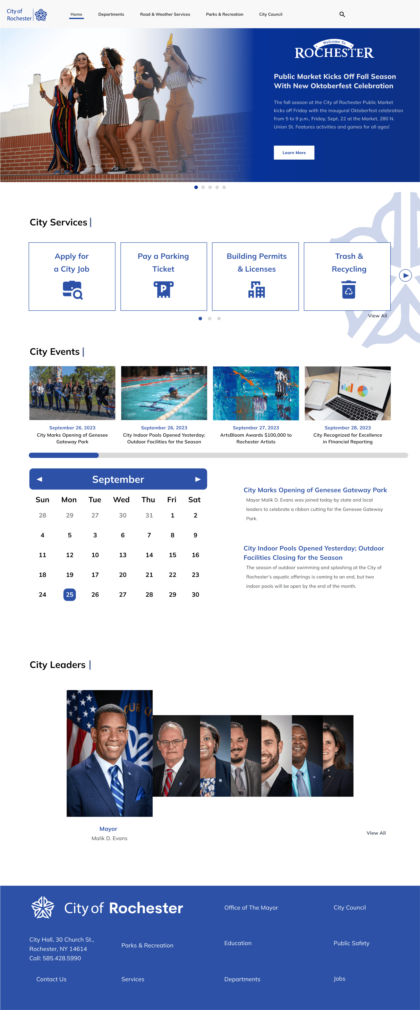
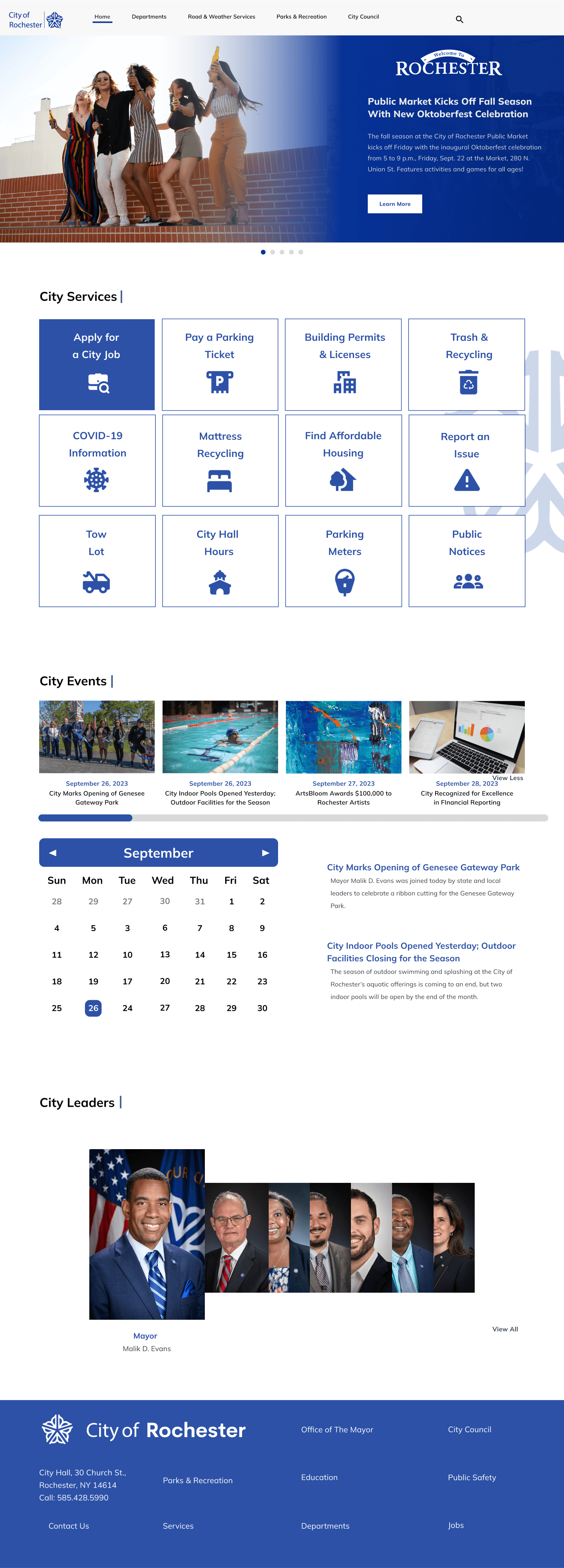
The goal of this redesign was to primarily focus on the main reasons for visiting the Rochester website, and making it as concise and easy to use as possible. The old design is outdated and a lot of users had difficulty navigating it when testing it in user interviews. To fix this, I made a website prototype that is very clear for the user, that prevents them from getting lost or confused.
Challenge
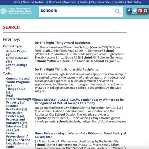
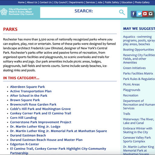
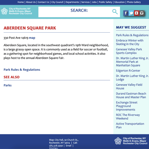
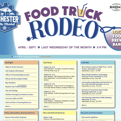
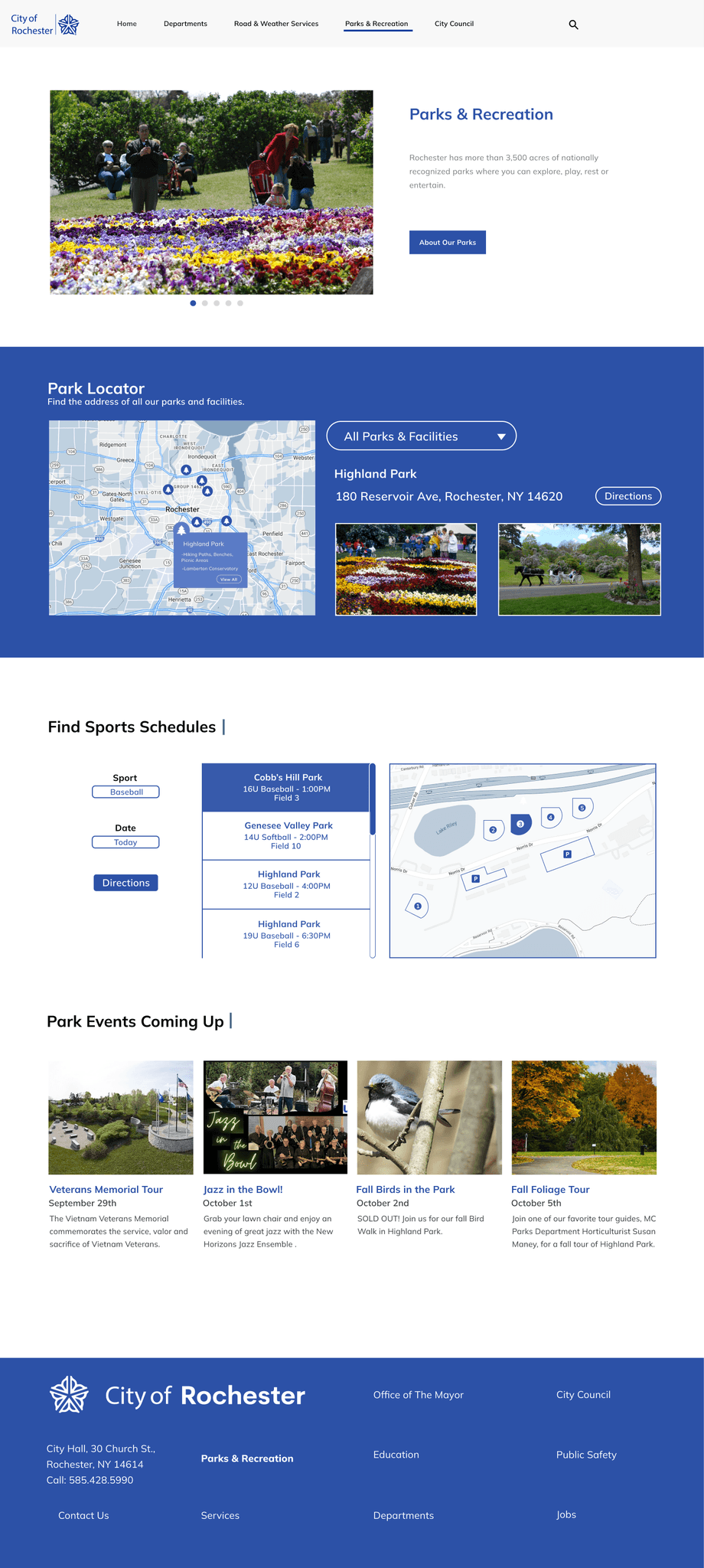
The main challenge was to create a prototype redesign the City of Rochester website. As a class we met with city staff to share innovative ideas for the new design. This offered a variety of challenges as the old website had a very outdated design and an overabundance of information on every page. We each chose one specific user flow to focus on and mine was:
Home – Parks – Sports – Schedules
Results
The results of the redesign improved the overall user experience as the new design enhanced navigation, making it easier for visitors to find information quickly and efficiently. I also introduced a modern aesthetic that features a fresh, new look that aligns with the City of Rochester, improving its appeal to users. It was also very important that I streamlined content as that was one of the main focuses that the client wanted. The information on each page was reorganized and condensed, reducing clutter and making key details more accessible.
Process
Research: I conducted usability testing to identify current pain points in the old design. I analyzed competitor websites and researched best practices in government website design to ensure a modern and effective approach.
Wireframing: I created low and high-fidelity wireframes to streamline the overabundance of information on the old site. I focused on presenting extremely well organized content that would be easy for the city residents to use and navigate.
Prototyping: I continuously prototyped several different interactions to offer a smooth viewing experience for the user. As well as that, I made a focus on emphasizing the branding of the current site to thematically match the city's values.
Visual Design: The visual design of the website was inspired by the City of Rochester branding. One of the main icons of the city is its logo, a white lilac flower that was designed to look like a water wheel. I used this as a main focus for the redesign due to how iconic the imagery was for the city.
Identifying The Issues: The Old Design
The New Design:
Conclusion
The redesign of the City of Rochester website was a significant undertaking that successfully addressed the challenges posed by its outdated design and overwhelming content. By focusing on user experience, I created a more intuitive navigation structure that allows visitors to find information quickly and easily. The modern aesthetic not only enhances the visual appeal but also aligns with government website design standards. Through thorough research and analysis, I ensured that the site is accessible to all users, promoting inclusivity within the community. Overall, this project has laid a solid foundation for a website that better serves the needs of Rochester residents and visitors.

